There are typically two approaches that people take when restoring a Victorian house. Approach one is a total renovation-taking a Victorian and turning it into a completely modern house with the exterior shell of a Victorian. Walls come down, walk-in closets and lacquer kitchen cabinets go up. The second approach is to rehab the house–maintain the architectural quirks and details while completing all the necessary structural and cosmetic updates. Of course, in either of these approaches people can get a little extreme in their approach. The renovators may knock down the entire building and simply leave the facade–which leads me to wonder why they bothered starting with a Victorian in the first place. The rehaber may retain (or introduce) details that were appropriately discarded decades ago (really ugly wallpaper is my favorite example).
Here at mad maison we’ve mostly taken approach number two-rehab. We haven’t knocked down any walls (though we’ve taken down some doors), and we didn’t paint any walls chartreuse green. There is one project we completed that the traditional rehabers will probably object to. Strongly.
Our living room is not particularly large. Typical of a Victorian, it’s somewhat narrow (it’s under 12 feet wide). Our dining room is actually a little larger than the living room. When mad moved into the house, we realized that the original mantel for the decorative fireplace took up a huge amount of space–and it’s larger-than-life presence completely dominated the room. It was the definition of a “focal point,” only we weren’t happy with was it was pointing to. The tone of the wood was something akin to “Florida orange” and the design, with it’s oval mirror, didn’t allow us to display art or anything personal. It was old, but it didn’t feel antique. Dear reader, you can judge for yourself:
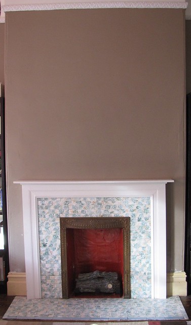
After considering our options (including painting, restaining, and taking out the mirror), mad made the controversial decision to remove the mantel. Yes, remove it. It actually came down in almost one whole piece–and we quickly learned it was hollow. Which made us think maybe it wasn’t that “precious” a detail as we might have originally thought. At that point we didn’t care either way, because immediately, the room opened up and felt better. Once the mantel was down, we were left with a fireplace and tile surround that were looking a little naked. So mad enlisted my brother to build a simple mantel. Here you can see the fireplace with the wood cleats he screwed into the wall:

naked mantel, about to be dressed. and please, don't ask what that stain is on the tile (we didn't).
After installing the cleats, my brother cut some standard pieces of moulding, and a top piece for the shelf. After the mantel was built, we realized that there was a gap in the baseboard because our new mantel was so much sleaker than the original one. So we liberated some small pieces of baseboard from the deepest recesses of our bedroom closet to fill in the gaps. Behold, here is the new fireplace, with a new mantel and a beautiful expanse of wall above it:
If you’re curious, we removed that icky stain with a natural degreaser that worked like magic, SafeChoice Super Clean. Of course, the fireplace still wasn’t perfect in my eyes. While the red firebox, brassy metal frame, and green/beige mottled tile may appeal to some, it just wasn’t our style. We seriously considered replacing all the tile, but also realized that would be a more appropriate project years from now when the rest of the house is complete. After extensive consideration and research (and a motivational post on yhl), we decided to paint the tile. Yes, paint the tile. Even though it’s a decorative fireplace we do use it with gel-fuel, so I painted the firebox and metal surround with a high-heat roll-on paint. For the tile, I sanded them lightly to “rough up” the surface, primed them, and painted them with two light and even coats of the same white semi-gloss paint we’ve used on all the woodwork in the house. Finally, I applied two light coats of Safecoat Acrylacq. It’s been a few months and the tile has done fine with and still looks fresh. We hope you agree:
I know there are people who will disapprove. They’ll suggest we should have embraced the old mantel and (what was for us) the nausea-inducing tile. One of my regular resources, This Old House would call us reckless. But this is our maison, after all. All the work we’ve done has reinforced that you have to make your house work for you. We spend time in our living room every day. Our fireplace has gone from something we hated, to something we felt ok about, to something we love to look at and can’t wait to decorate with holiday lights in December. If that makes us mad, so be it.


Well, I love it!!!!!!!! What a difference. It just looks great. I don’t see how anyone could think this was a bad idea.
I think it looks great. Haters gonna hate. Another thing I do that many old-house-lovers disagree with is replacing windows. Old windows are a total pain, and I LOVE having new windows that actually work.
Keep up the good work.
Thanks, Reuben! We completely agree with you. In fact, we also replaced some windows (Anna @ doorsixteen.com would not approve). Nice form is great, but I’m also a sucker for function. Thanks for stopping by.
Why, thank you. We’re thrilled with it–even if it is sacrilegious to old home owners.