Archive for the ‘Mike’s Office/Guest Room’ Category

fool me once. . .

Tuesday, July 12th, 2011

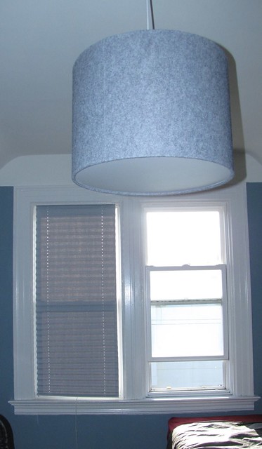
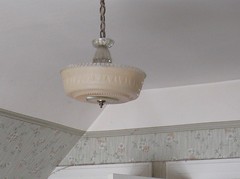
When you rehab every room in a house there are always small, lingering tasks. They don’t prevent you from using the room, but you know the room isn’t quite ready for prime time (or a blog post). Here at mad maison we have more than a few. Sometimes, completing those tasks can be more fulfilling than all the other work you put into a room. Recent examples are the ceiling fixtures in both our bedroom and mike’s office. You may be surprised to learn that mad wanted to replace the identical light fixtures in the two bedrooms:

Mike's Ceiling Fixture, before

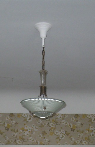
original bedroom fixtures

Perhaps you recall from a much earlier mad maison post, we were almost undone by the wiring in the living and dining rooms. In the bedrooms, we delayed replacing the lights until we found fixtures we loved and a better method. Once we found the fixture for mike’s office from Room & Board, I knew I would use a similar simple pendant/drum shade fixture in our bedroom. The night we purchased the light, as I was laying in bed looking at the old fixture, I remembered something Bob (the Room & Board salesperson) said about the wiring: “you could easily replace the housing unit for very little money with one that’s suitable for your house.” You see, the tops of the living room, dining room, and both bedroom lights all looked like this:

Dining Room Light, before

original dining room fixture

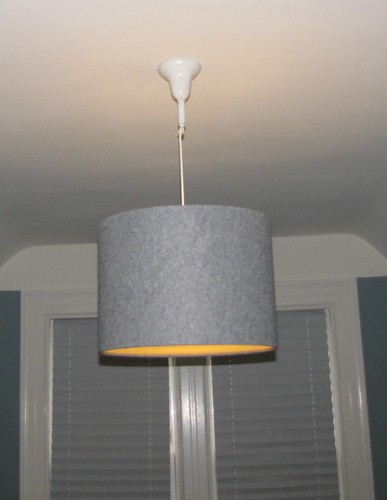
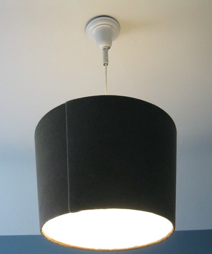
As you can see, there is a canopy (that sits against the ceiling), a rod that screws into the hickey (I swear, that‘s the name), a chain attached to the rod, and then the rest of the fixture. As I looked at the fixture still hanging in our bedroom, I realized I could probably cut the chain, reuse the rod and the canopy, spray-paint them (someone had painted the top of the fixture in the dining room), and then string our new pendants through them and install them quickly and easily. So that’s exactly what we did. I’m thrilled with the results. The pendants are very secure (especially since they’re much lighter than the earlier chandeliers) and I prefer the look of the white canopy on white ceiling to the chrome on white we currently have in the dining room and living room. And, the design works better with this 103 year-old house. See for yourself:

Mike's office Ceiling LIght

new ceiling fixture in mike's office

Bedroom Ceiling Light

new bedroom ceiling fixture

In fact, when we’re done with everything else in the house, and I’m able to find suitable canopies and rods for the living room and dining room, I might even rewire our current pendants in those two rooms. Of course, that won’t happen for quite some time. We have many other small tasks (like our kitchen, bathroom, and hallway) to finish first. Perhaps most satisfying of all is the realization  that we’re actually getting smarter and learning from our mistakes. Our house may be able to fool us once, but not twice.
stretching out. . .

Sunday, May 15th, 2011

Last weekend mike and i were wrapped up in mother’s day festivities–and this week we were felled by a nasty case of viral gastroenteritis. This weekend we celebrated our renewed health by putting together a new desk for mike’s office. As a reminder, here’s what the old desk looked like:
2nd bedroom, post rehab

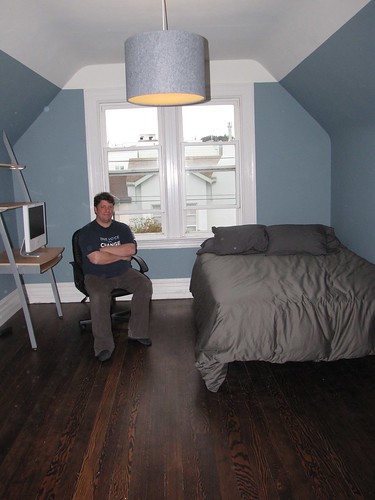
While the “ladder” style desk worked well in Queens (in our tiny second bedroom), the style doesn’t work in our current bedrooms due to the hanging eaves. In addition, we decided to get a desk that works better in the larger space. After a bit of research we went with the expedit bookcase and desk. I’m happy with how it fills the room–and mike’s happy that he can now put his scanner next to his computer rather than on the shelf above it:

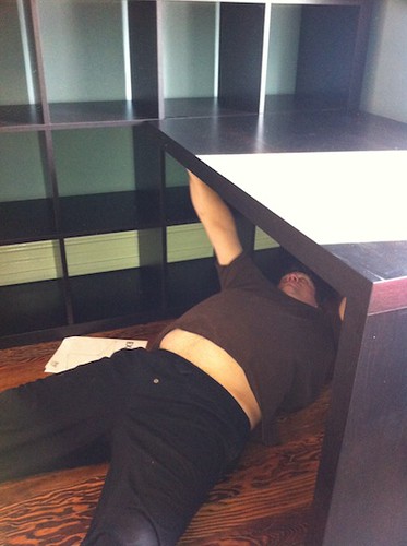
Of course, putting together ikea pieces comes with certain frustrations. Thankfully, Mike only had to position himself like this:
IMG_0301
for two hex screws positioned under the desk. It wouldn’t be an ikea piece without the use of an allen key and cam screws.

The saga of the window coverings

Wednesday, April 6th, 2011

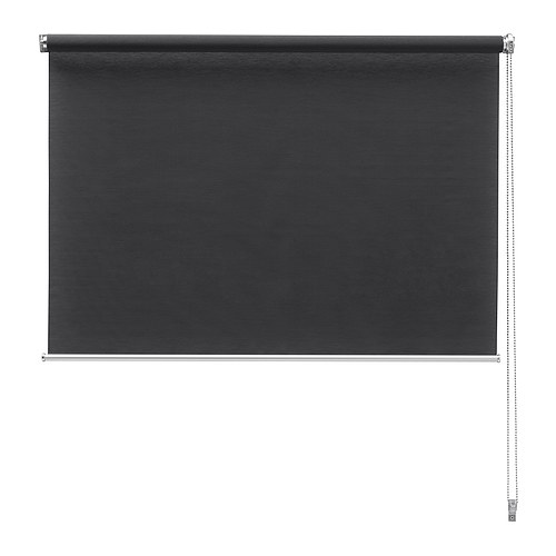
It’s interesting how a room comes together–and the little challenges you face along the way. Given that the upstairs of mad maison is petite (two bedrooms connected by a small landing/hallway that is also connected to the bathroom and the staircase), mike and I knew that we wanted to use the same color paint in both bedrooms to “tie them together” as they’d say on HGTV. Which means before we started stripping the wallpaper in mike’s office we knew what color the walls would be. And a few months ago, while looking for a chair we encountered a beautiful grey felt pendant lamp at Room & Board. It was a great deal (over 1/2 off the retail price), so we snatched it up even though we knew it would be months before it was installed. And before you can say “color splash” we had “selected” the primary colors for the room–the soft blue on the walls and grey (and then I decided we could throw some splashes of red in the mix). Given that we’d already chosen red window coverings in the living/dining rooms, we decided to go with grey window coverings in this room. In addition, we figured out that we’ll probably put a low console under the windows, so we knew that shades or blinds would be better than curtains. We also really like the clean and tailored look of minimal window coverings that show off as much of our beautiful window frames as possible. Never fear, I knew that ikea would serve us well. Two of my favorite shelter blogs have sung the praises of the ikea Enje roller shade, and I learned they produced a dark grey version of the shade. I mean, they really are perfect. We wouldn’t even have to cut them:

Ikea Enje Shade, dark grey

ikea delivers, again

Or not. As I start looking for a local ikea that has the shades in stock, I keep coming up short. There aren’t any in our two Bay Area ikeas. There aren’t any in Sacramento, or Southern California. I quickly realize they aren’t available anywhere in the US. So I email the good folks at ikea only to learn that they’ve been discontinued. Which is what can drive you crazy about a place like ikea–what could have possibly possessed them to get rid of a clearly popular item? Alas, we’ll never know. We’ll also never know why the shades are still available to our noble neighbors to the north but not us (I’m sure I could come up with a sarcastic political joke, but this is not that kind of blog). But I do know that I have some pretty immediate window covering needs. Any time we wanted to get dressed we needed to close the door to mike’s office. Direct sunlight left mike’s computer unusable due to glare for the better part of the day. My only recourse was the interwebs. I encourage all of our fearless readers to start looking online for grey roller shades that are between 24-25″ wide. Oh, and of course, please limit your search to coverings that will cost less than $50 a shade (which is still more than I wanted to spend). You’re not going to find much. From Target and jcp.com to the shade store and blinds galore. I finally found a shade I thought would work from my good friends at overstock.com:

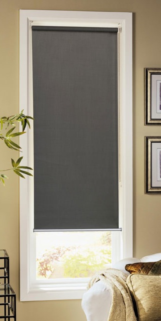
Overstock.com Option

perfect, you would think

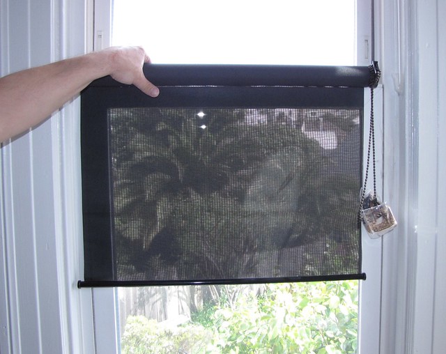
Alas, when we received the shades, here’s what it looked like:

Window Covering Misstep

not so perfect. notice the transparency feature!

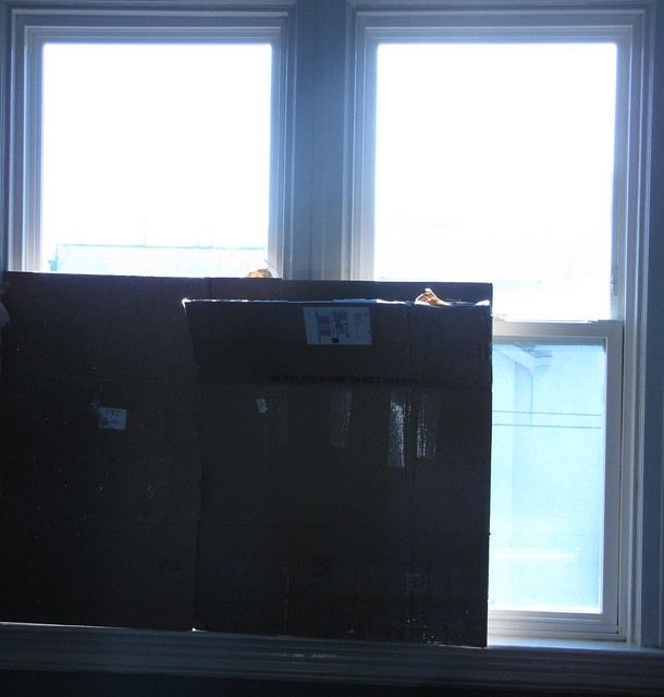
Not only will you notice that the shade looks a lot more black than grey, but they aren’t that private either. . . so back they went. And back to door closing and computer screen glare. My partner was getting understandably frustrated. In a moment of weakness, he even did this:

Temporary Solution #1

glare can cause desperate acts

For those of you who know me well, you know that when I rarely admit defeat in such situations. My research continued. So one day I was browsing lowes.com and encountered a temporary, paper grey shade for only $9–that was in stock at my local store. And, it had a good review by a happy customer. My curiosity and my skepticism were definitely piqued. $9 seemed like a pretty safe gamble to me. So on the way home from work I picked up said shade, completed the quick and easy process of cutting it to size and Mike installed it. And here is the result:

Temporary Solution #2

our temporary fix that we want to keep

The color works well with our beautiful pendant light. The texture is a lovely. The light blockage is right where we want it–no glare, but continuing to let a little light in. mike is so happy he’s proposing they might work as a “permanent” solution to our window covering challenge. Even if that’s not the case, we now have a realistic solution that will work until we find another covering that we absolutely love–or we decide to take a trip to Canada.

another room bites the dust

Wednesday, March 23rd, 2011

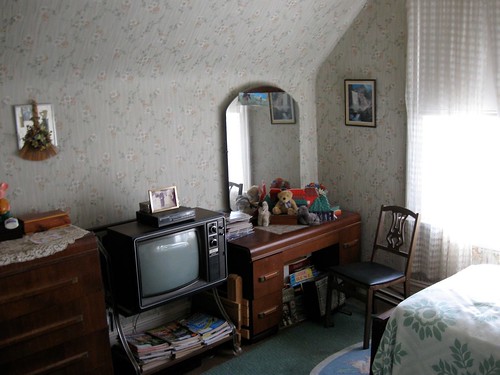
The rumors that mike and I were buried under a pile of stripped wallpaper and spackle are not true. We’re alive and kicking, and continuing to improve our little abode room by room. I will admit that we dragged our feet on this latest room a little more than usual. You may ask why. I think it was a combination of factors, including the aforementioned home rehab fatigue, a new job for me, and other small projects we’ll share with you in upcoming posts. I think the biggest reason, however, is that we didn’t have to rush this room. Every other room we’ve worked on was a room that we spent time in or walked by every day–the living room, dining room, and our bedroom couldn’t be ignored (even when we wanted to ignore them). With Mike’s office, we made some adjustments that allowed us to close the door to the room when we weren’t actively working on it. We temporarily relocated Mike’s desk and all other essential furniture to our bedroom. On one level, it was lovely. But on another level it was definitely a procrastination-friendly setup. And while the room looks a little monastic right now (it’s the first time I’ve seen a room in person that didn’t have enough furniture in it), the walls don’t wiggle and the wallpaper is gone. We’re not done “designing” the room, but we are done rehabbing it and we think the results are pretty dramatic. Here’s one before shot (you can see others on our flickr site):

2nd bedroom before 4

Mike's office before

And here’s the same point of view yesterday:
2nd bedroom, post rehab

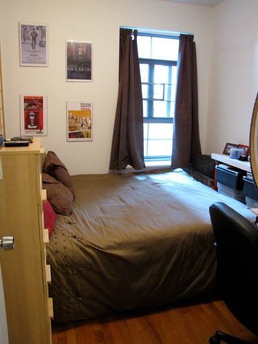
And for a little extra perspective, here’s what Mike’s office looked like back in New York:
2nd bedroom in nyc

We’re still trying to figure out what Mike’s going to do with all the extra space. Right now, Mike is thoroughly enjoying the echo. I promise, as we add more furniture and little things like window coverings we’ll happily share the results with you.

Mike and I are planning to work on our front hallway next–so we’ll be back to “in your face” rehabbing toot sweet

mad 1, wallpaper 0

Friday, July 2nd, 2010

mad is celebrating this fourth of July weekend by continuing to assert our independence from wallpaper. The optimism displayed in my previous post was validated today when mad removed all of the remaining wallpaper from Mike’s office walls. Using both DIF and our power steamer, we were able to eradicate all of the wallpaper in a few hours.

Removing Wallpaper from Mike's Office

Mike persevering over wallpaper thanks to DIF and our Power Steamer

Of course, removing the wallpaper is the first of many steps in rehabbing a room mad style. We now have to wash the walls with TSP, and of course, complete the ever-important plaster repair. We’re trying something a little new at mad maison and sharing a short video of our old plaster walls that wiggle off the lathe:

mad’s taking a much-deserved couple of days off to enjoy the holiday weekend, but we’ll be back next week with plaster repair, spackling, priming, and painting.